Layer Types
JsonCut supports five main layer types, each designed for specific visual elements. Layers are rendered in the order they appear in your configuration, from bottom to top.
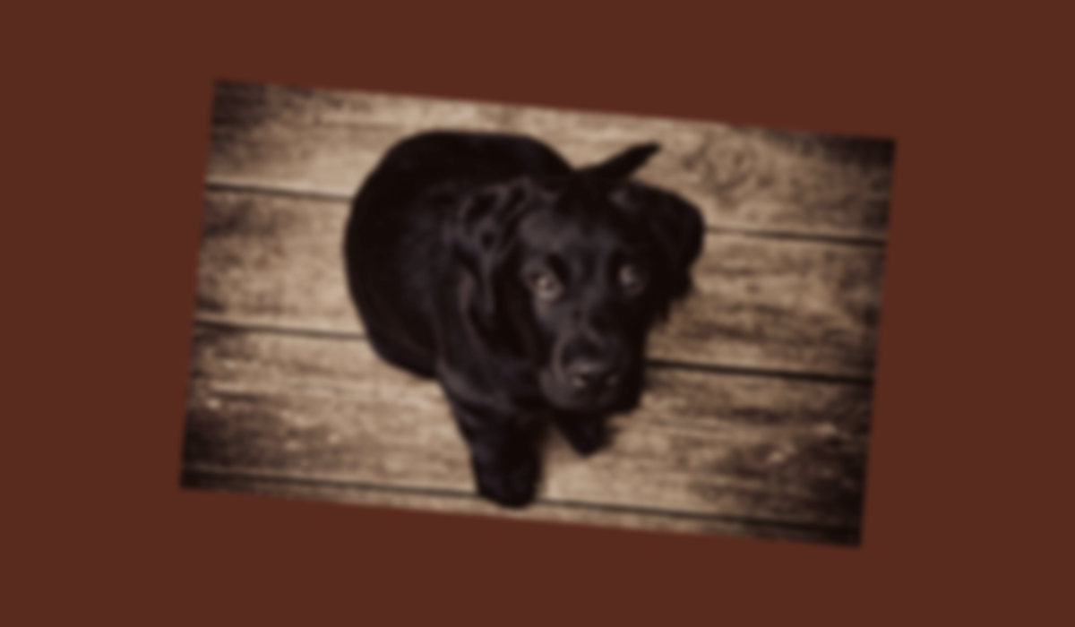
Image Layers
Display uploaded images with advanced positioning and effects.
Instead of an uploaded path, you may provide a public HTTP(S) URL for images in properties like path, url, or src. The URL must end with a supported image extension (e.g. .png, .jpg, ...). At job creation, the file is fetched and replaced with a secure relative storage path automatically.
{
  "type": "image",
  "config": {
    "width": 1200,
    "height": 700,
    "backgroundColor": "#592B1E",
    "layers": [
      {
        "type": "image",
        "path": "/image/2000-09-09/cmejszvz00/5399b3f3-a21e-4161-bc9e-9dc64f383e19.jpg",
        "position": "center",
        "width": 800,
        "height": 600,
        "fit": "contain",
        "opacity": 0.8,
        "rotation": 5,
        "blur": 4
      }
    ]
  }
}
Properties
| Property | Type | Required | Description |
|---|---|---|---|
path | string | ✅ | Relative path to uploaded image (e.g., /image/2024-01-15/user123/file.jpg) or a public HTTP(S) URL with a supported image extension |
x, y | number | ❌ | Position in pixels |
width, height | number | ❌ | Scaled dimensions |
fit | string | ❌ | How to fit image: cover, contain, fill, inside, outside |
opacity | number | ❌ | Transparency (0-1) |
rotation | number | ❌ | Rotation in degrees |
blur | number | ❌ | Blur radius in pixels |
borderRadius | number | ❌ | Corner radius in pixels for rounded edges |
Fit Modes
- cover - Crop to fill dimensions while maintaining aspect ratio
- contain - Scale to fit within dimensions, may leave empty space
- fill - Stretch to exact dimensions, may distort image
- inside - Scale down only, never up
- outside - Scale to cover dimensions, may crop
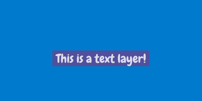
Text Layers
Add text with extensive typography control and custom font support.
{
  "type": "image",
  "config": {
    "width": 800,
    "height": 400,
    "backgroundColor": "#007acc",
    "layers": [
      {
        "type": "text",
        "text": "This is a text layer!",
        "x": 400,
        "y": 200,
        "fontSize": 48,
        "fontPath": "/font/2000-01-09/cmejszvz00/cd9c64d5-c92c-4c04-9ebc-b976361c3f5e.ttf",
        "color": "#FFFFFF",
        "align": "center",
        "opacity": 0.8,
        "rotation": 0,
        "backgroundColor": "#644691"
      }
    ]
  }
}
Properties
| Property | Type | Required | Description |
|---|---|---|---|
text | string | ✅ | Text content to display |
x, y | number | ❌ | Position in pixels |
fontSize | number | ❌ | Font size in pixels (default: 24) |
fontFamily | string | ❌ | Font family name (default: "Arial") |
fontPath | string | ❌ | Path to custom font file |
googleFont | string | ❌ | Google Font (e.g., "Roboto:600") - alternative to fontPath |
color | string | ❌ | Text color (default: "#000000") |
align | string | ❌ | Text alignment: left, center, right |
wrap | boolean | ❌ | Enable text wrapping |
lineHeight | number | ❌ | Line height multiplier (e.g., 1.2) |
backgroundColor | string | ❌ | Text Background color as Hex code (Note: Only works with single line text) |
Upload your own fonts via the Files API and use fontPath, or use googleFont for instant access to Google Fonts. Use exact casing (e.g., "Roboto" not "roboto"). See Text Rendering for detailed font usage.
Rectangle Layers
Create solid or outlined rectangular shapes for backgrounds, borders, and UI elements.

{
  "type": "image",
  "config": {
    "width": 600,
    "height": 300,
    "backgroundColor": "#6B6B6B",
    "layers": [
      {
        "type": "rectangle",
        "x": 100,
        "y": 50,
        "width": 400,
        "height": 200,
        "fill": "#007acc",
        "stroke": "#004d7a",
        "strokeWidth": 4,
        "opacity": 0.8
      }
    ]
  }
}
Properties
| Property | Type | Required | Description |
|---|---|---|---|
x, y | number | ✅ | Position in pixels |
width, height | number | ✅ | Rectangle dimensions |
fill | string | ❌ | Fill color (hex, rgb, or named color) |
stroke | string | ❌ | Border color |
strokeWidth | number | ❌ | Border width in pixels |
opacity | number | ❌ | Transparency (0-1) |
rotation | number | ❌ | Rotation in degrees |
blur | number | ❌ | Blur radius in pixels |
borderRadius | number | ❌ | Corner radius in pixels for rounded edges |
Style Variations

{
  "type": "image",
  "config": {
    "width": 500,
    "height": 200,
    "backgroundColor": "#f8f9fa",
    "layers": [
      {
        "type": "rectangle",
        "x": 50,
        "y": 50,
        "width": 100,
        "height": 100,
        "fill": "#ff6b6b"
      },
      {
        "type": "rectangle",
        "x": 200,
        "y": 50,
        "width": 100,
        "height": 100,
        "stroke": "#4ecdc4",
        "strokeWidth": 3
      },
      {
        "type": "rectangle",
        "x": 350,
        "y": 50,
        "width": 100,
        "height": 100,
        "fill": "#45b7d1",
        "stroke": "#2c3e50",
        "strokeWidth": 2
      }
    ]
  }
}
Circle Layers
Add circular and elliptical shapes for icons, decorative elements, and UI components.
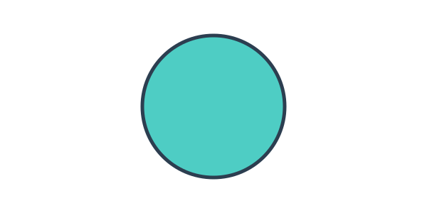
{
  "type": "image",
  "config": {
    "width": 600,
    "height": 300,
    "backgroundColor": "#ffffff",
    "layers": [
      {
        "type": "circle",
        "x": 200,
        "y": 50,
        "width": 200,
        "height": 200,
        "fill": "#4ecdc4",
        "stroke": "#2c3e50",
        "strokeWidth": 5
      }
    ]
  }
}
Properties
| Property | Type | Required | Description |
|---|---|---|---|
x, y | number | ✅ | Position in pixels |
width, height | number | ✅ | Circle/ellipse dimensions |
fill | string | ❌ | Fill color |
stroke | string | ❌ | Border color |
strokeWidth | number | ❌ | Border width in pixels |
opacity | number | ❌ | Transparency (0-1) |
blur | number | ❌ | Blur radius in pixels |
To create a perfect circle, set width and height to the same value. Different values create ellipses.
Gradient Layers
Create smooth color transitions for backgrounds and visual effects.
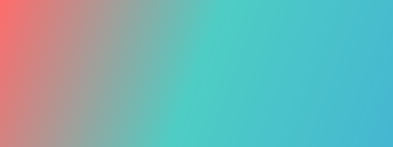
{
  "type": "image",
  "config": {
    "width": 800,
    "height": 300,
    "layers": [
      {
        "type": "gradient",
        "x": 0,
        "y": 0,
        "width": 800,
        "height": 300,
        "gradient": {
          "type": "linear",
          "colors": ["#ff6b6b", "#4ecdc4", "#45b7d1"],
          "direction": "diagonal"
        }
      }
    ]
  }
}
Properties
| Property | Type | Required | Description |
|---|---|---|---|
x, y | number | ✅ | Position in pixels |
width, height | number | ✅ | Gradient area dimensions |
gradient | object | ✅ | Gradient configuration |
opacity | number | ❌ | Transparency (0-1) |
rotation | number | ❌ | Rotation in degrees |
blur | number | ❌ | Blur radius in pixels |
Gradient Types
Linear Gradients

{
  "type": "image",
  "config": {
    "width": 600,
    "height": 300,
    "layers": [
      {
        "type": "gradient",
        "x": 0,
        "y": 0,
        "width": 600,
        "height": 300,
        "gradient": {
          "type": "linear",
          "colors": ["#667eea", "#764ba2"],
          "direction": "vertical"
        }
      }
    ]
  }
}
Direction options:
horizontal- Left to rightvertical- Top to bottomdiagonal- Top-left to bottom-right
Radial Gradients
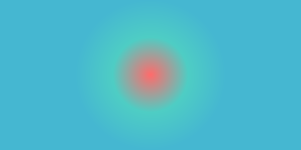
{
  "type": "image",
  "config": {
    "width": 600,
    "height": 300,
    "layers": [
      {
        "type": "gradient",
        "x": 0,
        "y": 0,
        "width": 600,
        "height": 300,
        "gradient": {
          "type": "radial",
          "colors": ["#ff6b6b", "#4ecdc4", "#45b7d1"]
        }
      }
    ]
  }
}
Multi-Color Gradients
You can use any number of colors in your gradients:

{
  "type": "image",
  "config": {
    "width": 600,
    "height": 200,
    "layers": [
      {
        "type": "gradient",
        "x": 0,
        "y": 0,
        "width": 600,
        "height": 200,
        "gradient": {
          "type": "linear",
          "colors": [
            "#ff9a9e",
            "#fecfef",
            "#fecfef",
            "#a8edea",
            "#fed6e3",
            "#d299c2"
          ],
          "direction": "horizontal"
        }
      }
    ]
  }
}
Best Practices
Performance Tips
- Optimize layer count - Keep under 50 layers for best performance
- Use appropriate image sizes - Don't use 4K images for small elements
- Minimize blur effects - High blur values can slow processing
Design Guidelines
- Layer hierarchy - Place backgrounds first, foreground elements last
- Consistent styling - Use defaults for repeated properties
- Readable text - Ensure sufficient contrast against backgrounds
- Mobile considerations - Test designs at different sizes
Common Patterns
Card Design
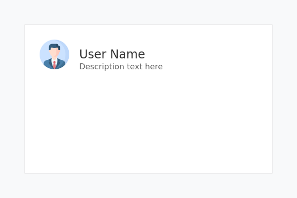
{
  "type": "image",
  "config": {
    "width": 600,
    "height": 400,
    "backgroundColor": "#f8f9fa",
    "layers": [
      {
        "type": "rectangle",
        "x": 50,
        "y": 50,
        "width": 500,
        "height": 300,
        "fill": "#ffffff",
        "stroke": "#e0e0e0",
        "strokeWidth": 1
      },
      {
        "type": "image",
        "path": "/image/2000-02-09/cmejszvz00/avatar-example.png",
        "x": 80,
        "y": 80,
        "width": 60,
        "height": 60
      },
      {
        "type": "text",
        "text": "User Name",
        "x": 160,
        "y": 95,
        "fontSize": 24,
        "color": "#333333"
      },
      {
        "type": "text",
        "text": "Description text here",
        "x": 160,
        "y": 125,
        "fontSize": 16,
        "color": "#666666"
      }
    ]
  }
}
Next Steps
- HTML Layer - Render HTML/CSS content and screenshots
- Positioning System - Learn advanced positioning techniques
- Text Rendering - Master typography and custom fonts
- Visual Effects - Explore filters and transformations
- Examples - See complete real-world examples