Layer Ordering & Visual Effects
JsonCut provides powerful visual effects that can be applied to any layer type. These effects allow you to create sophisticated designs with depth, motion, and visual interest.
Stacking Order
Layers are rendered in the order they appear in your configuration:

{
  "type": "image",
  "config": {
    "width": 600,
    "height": 300,
    "layers": [
      {
        "type": "gradient",
        "x": 0, "y": 0, "width": 600, "height": 300,
        "gradient": { "type": "linear", "colors": ["#667eea", "#764ba2"] }
      },
      {
        "type": "rectangle",
        "x": 50, "y": 50, "width": 200, "height": 150,
        "fill": "#ffffff", "opacity": 0.9
      },
      {
        "type": "text",
        "text": "On Top", "x": 150, "y": 125,
        "fontSize": 32, "color": "#333333", "align": "center"
      }
    ]
  }
}
Opacity Effect

{
  "type": "image",
  "config": {
    "width": 600,
    "height": 300,
    "layers": [
      {
        "type": "gradient",
        "x": 0, "y": 0, "width": 600, "height": 300,
        "gradient": { "type": "linear", "colors": ["#667eea", "#764ba2"] }
      },
      {
        "type": "rectangle",
        "x": 50, "y": 50, "width": 200, "height": 150,
        "fill": "#ffffff", "opacity": 0.9
      },
      {
        "type": "text",
        "text": "On Top", "x": 150, "y": 125,
        "fontSize": 32, "color": "#333333", "align": "center"
      }
    ]
  }
}
Opacity Values
| Value | Effect | Use Case |
|---|---|---|
1.0 | Fully opaque | Normal elements |
0.9 | Slightly transparent | Subtle overlays |
0.7 | Semi-transparent | Layered elements |
0.5 | Half transparent | Background overlays |
0.3 | Mostly transparent | Watermarks |
0.1 | Nearly invisible | Subtle effects |
Rotation

{
  "type": "image",
  "config": {
    "width": 600,
    "height": 300,
    "backgroundColor": "#ffffff",
    "layers": [
      {
        "type": "rectangle",
        "x": 100, "y": 125, "width": 80, "height": 50,
        "fill": "#4ecdc4",
        "rotation": 0
      },
      {
        "type": "rectangle",
        "x": 260, "y": 125, "width": 80, "height": 50,
        "fill": "#4ecdc4",
        "rotation": 25
      },
      {
        "type": "rectangle",
        "x": 420, "y": 125, "width": 80, "height": 50,
        "fill": "#4ecdc4",
        "rotation": 45
      }
    ]
  }
}
Rotation Guidelines
- Positive values: Clockwise rotation
- Negative values: Counter-clockwise rotation
- Range: -360° to 360° (values wrap around)
- Pivot point: Center of the element
Blur
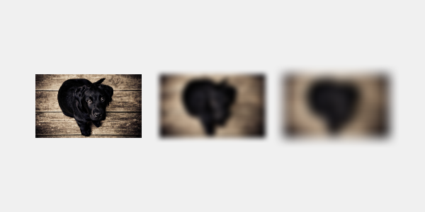
{
  "type": "image",
  "config": {
    "width": 600,
    "height": 300,
    "backgroundColor": "#f0f0f0",
    "layers": [
      {
        "type": "image",
        "path": "/image/2000-01-09/cmejszvz00/5399b3f3-a21e-4161-bc9e-9dc64f383e19.jpg",
        "x": 50, "y": 75, "width": 150, "height": 150,
        "fit": "contain",
        "blur": 0
      },
      {
        "type": "image",
        "path": "/image/2000-01-09/cmejszvz00/5399b3f3-a21e-4161-bc9e-9dc64f383e19.jpg",
        "x": 225, "y": 75, "width": 150, "height": 150,
        "fit": "contain",
        "blur": 4
      },
      {
        "type": "image",
        "path": "/image/2000-01-09/cmejszvz00/5399b3f3-a21e-4161-bc9e-9dc64f383e19.jpg",
        "x": 400, "y": 75, "width": 150, "height": 150,
        "fit": "contain",
        "blur": 8
      }
    ]
  }
}
Blur Intensity
| Value | Effect | Use Case |
|---|---|---|
1-2 | Subtle softening | Light effects |
3-5 | Noticeable blur | Depth of field |
6-10 | Strong blur | Background effects |
10+ | Heavy blur | Artistic effects |
Performance
Minimize blur effects - High blur values can slow processing
Effect Best Practices
Performance Considerations
- Limit blur effects - High blur values can slow processing
- Use opacity sparingly - Too many transparent layers can impact performance
- Combine similar effects - Group layers with similar effects when possible
Design Guidelines
- Consistency - Use effects consistently throughout your design
- Subtlety - Less is often more with visual effects
- Purpose - Every effect should serve a design purpose
- Hierarchy - Use effects to create visual hierarchy
Common Effect Patterns
Glass Morphism
Create modern glass-like effects:
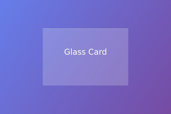
{
  "type": "image",
  "config": {
    "width": 600,
    "height": 400,
    "layers": [
      {
        "type": "gradient",
        "x": 0, "y": 0, "width": 600, "height": 400,
        "gradient": { "type": "linear", "colors": ["#667eea", "#764ba2"] }
      },
      {
        "type": "rectangle",
        "x": 150, "y": 100, "width": 300, "height": 200,
        "fill": "#ffffff",
        "opacity": 0.2,
        "blur": 1
      },
      {
        "type": "rectangle",
        "x": 150, "y": 100, "width": 300, "height": 1,
        "fill": "#ffffff",
        "opacity": 0.4
      },
      {
        "type": "text",
        "text": "Glass Card",
        "position": { "x": 0.5, "y": 0.45, "originX": "center", "originY": "center" },
        "fontSize": 28, "color": "#ffffff"
      }
    ]
  }
}
Neon Glow
Simulate neon lighting effects:
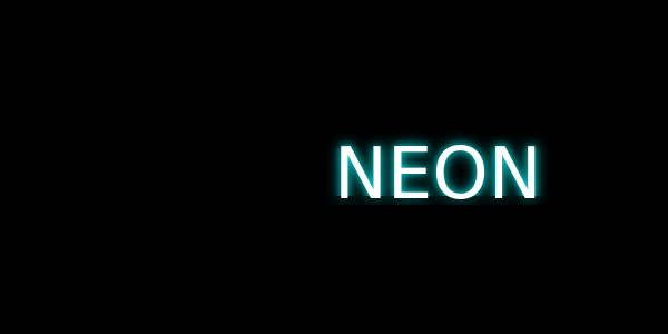
{
  "type": "image",
  "config": {
    "width": 600,
    "height": 300,
    "layers": [
      {
        "type": "rectangle",
        "x": 0, "y": 0, "width": 600, "height": 300,
        "fill": "#000000"
      },
      {
        "type": "text",
        "text": "NEON",
        "position": "center",
        "fontSize": 64, "color": "#00ffff",
        "blur": 8,
        "opacity": 0.6
      },
      {
        "type": "text",
        "text": "NEON",
        "position": "center",
        "fontSize": 64, "color": "#00ffff",
        "blur": 4,
        "opacity": 0.8
      },
      {
        "type": "text",
        "text": "NEON",
        "position": "center",
        "fontSize": 64, "color": "#ffffff"
      }
    ]
  }
}
Effect Limitations
Technical Constraints
- Blur radius: Maximum recommended value is 20px
- Rotation: Values wrap at 360°
- Opacity: Must be between 0 and 1
- Performance: Complex effects may increase processing time
Troubleshooting Effects
Common Issues
Effects not visible:
- Check opacity values (0 = invisible)
- Ensure blur values are reasonable (1-10)
- Verify rotation values are in degrees
Performance issues:
- Reduce blur intensity
- Limit number of effects
- Optimize layer count
Unexpected results:
- Check layer stacking order
- Verify effect combinations
- Test with simpler configurations
Next Steps
- Text Rendering - Learn about text-specific effects and styling
- Examples - See effects in real-world designs
- Layer Types - Understand how effects apply to different layer types